GraphOmics User Guide
The following user guide describes a typical workflow of a GraphOmics analysis starting from data uploading, interactive data exploration and potential hypothesis discovery through multi-omics data integration and analysis on the GraphOmics platform.
Throughout this user guide, we will use as an example the Covid-19 dataset from Proteomic and Metabolomic Characterization of COVID-19 Patient Sera . The dataset comprise of a dual-omics (proteomics and metabolomics) study on the sera of a cohort of 28 severe Covid-19 patients in comparison to a cohort of 28 healthy patients. Analysis of this data is also performed in the GraphOmics paper under the ‘Covid-19 Case Study’ section.
1. Data Uploading
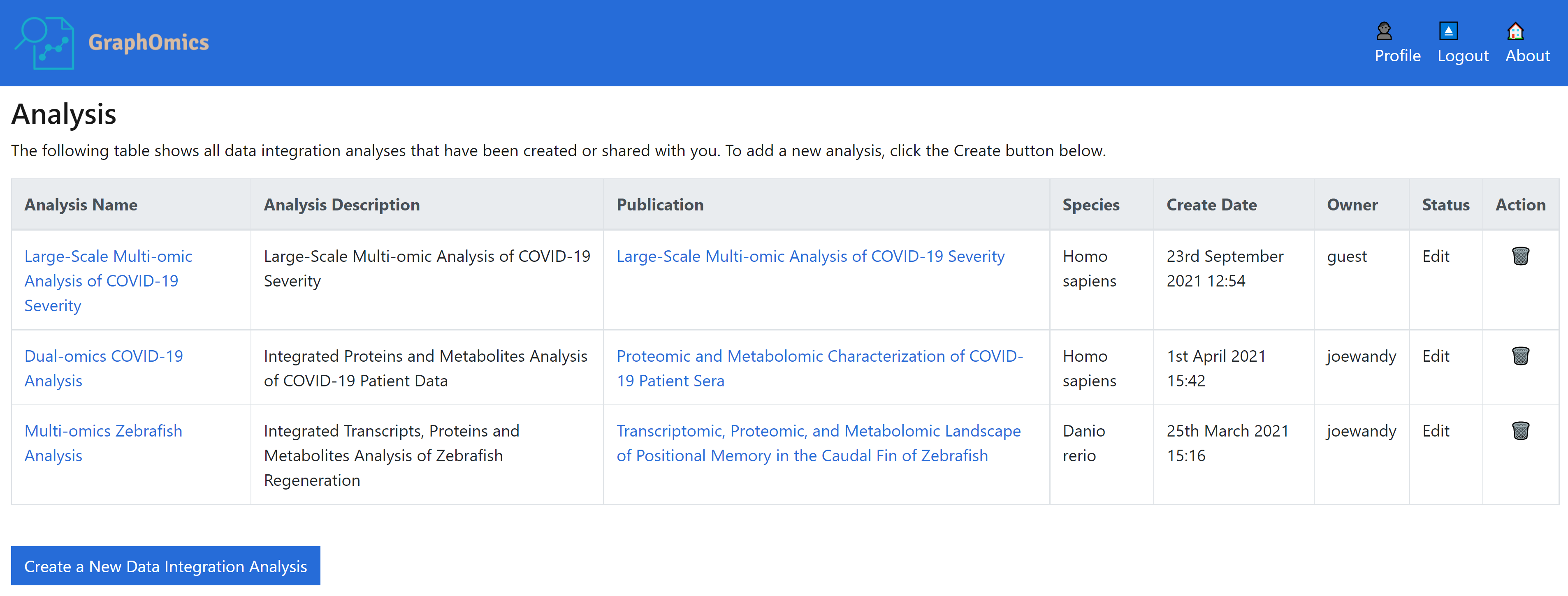
The first step to performing analysis on GraphOmics is to upload your data to the platform. To do this, head to the main page of GraphOmics. You will list the list of analysis currently owned or shared with you. At the bottom of the screen, click the [Create a New Data Integration Analysis] button. You will see a screen that lets you enter or upload your data.
a. Enter Data
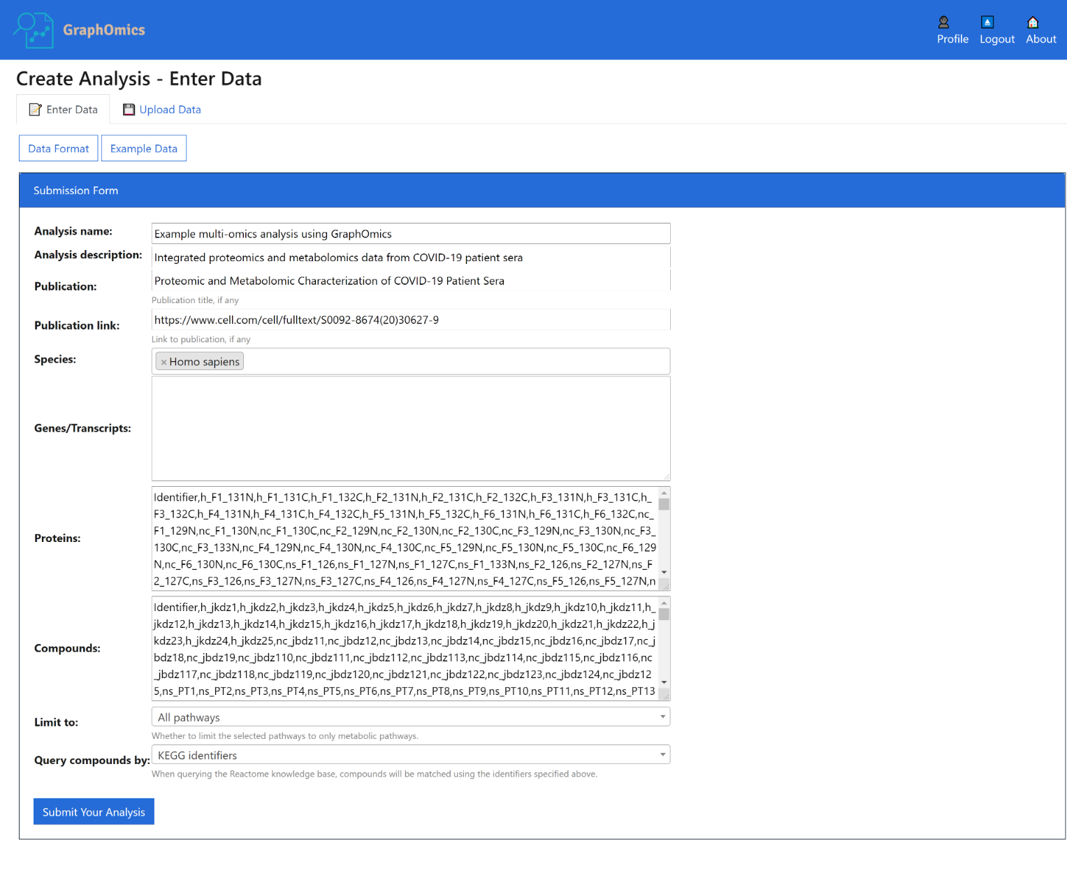
From the Enter Data page that shows, you can upload your data in CSV format. The format is documented on the page itself (click the [Data Format] button), and is also reproduced here:
Create a new data integration analysis by entering its data below in comma-separated values format.
Analysis description is optional and can be left blank.
Other fields for the data should be provided in a comma-separated format.
For each -omics data:
- The first row is the header, and the first column is always used as the identifier column.
- Other columns are taken as the sample measurements.
- If present, a second row that begins with group can also be provided to specify the grouping information.
To load example Covid-19 data that we will use throughout this user guide, click the [Example Data] button.
b. Upload Data
Alternatively you can also upload data that is already available in CSV format into the system. The format used is similar to the above, but here you can also upload additional CSV files that specify the design matrix, including group assignments and other factors that are relevant to particular samples.
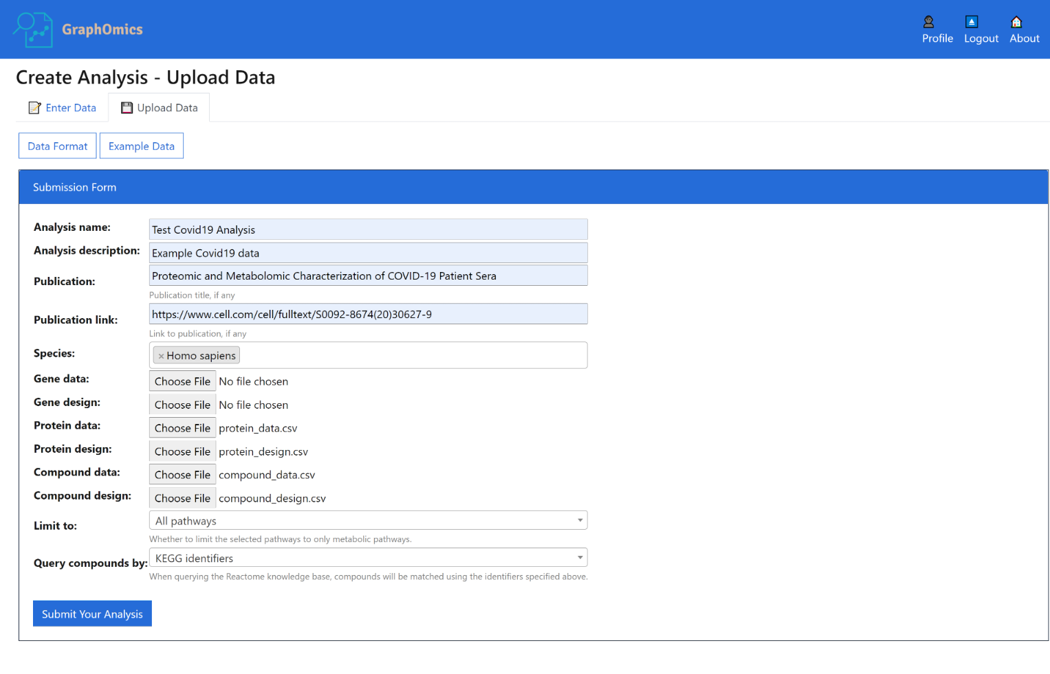
Create a new data integration analysis by uploading data following the example format below.
- Analysis description is optional and can be left blank.
- Other fields for the data should be provided in a comma-separated format.
- For each omics data available, the following two files should be provided, otherwise they can be left blank.
To view example data, click the [Example Data] button. Two example data are provided:
1.
Example Zebrafish dataset [1]
2.
Example Covid19 dataset [2]
The Limit to options restricts whether to map entities to all pathways found in Reactome, or metabolic pathways only.
The Query compounds by options determines whether to map metabolite entities based on their KEGG or ChEBI IDs. You might get different results depending on which identifier is used depending on Reactome coverage of those compounds.
Once you’ve entered all the data, click the [Submit Your Analysis] button. The analysis will upload. It might take a while until it is completed, so please be patient.
2. Interactive Omics Data Exploration via the Data Browser
Uploaded data containing transcripts, proteins and metabolite entities are mapped to Reactome’s reactions and pathways during horizontal omics integration. Note that any entities that can’t be mapped, where no information is available on that entity in Reactome, will be dropped. The integrated omics data can now be browsed through various views in GraphOmics. Significantly changing entities can be examined can be examined in relation to other connected entities and to reactions and pathways, and to clustering information. Pathways could also be ranked by their activity levels. The following sections explain how interactive data exploration could be done in GraphOmics.
The Data Browser is the primary interface in GraphOmics that facilitate linked explorations of multi-modals transcripts, proteins and metabolite data. From the Data Browser, users could click an entity, e.g. a protein, and the relationships of that protein to other entities (transcripts, metabolites, reactions and pathways) will be revealed. This makes it easy for users to examine the context in which a significantly changing entity is found.
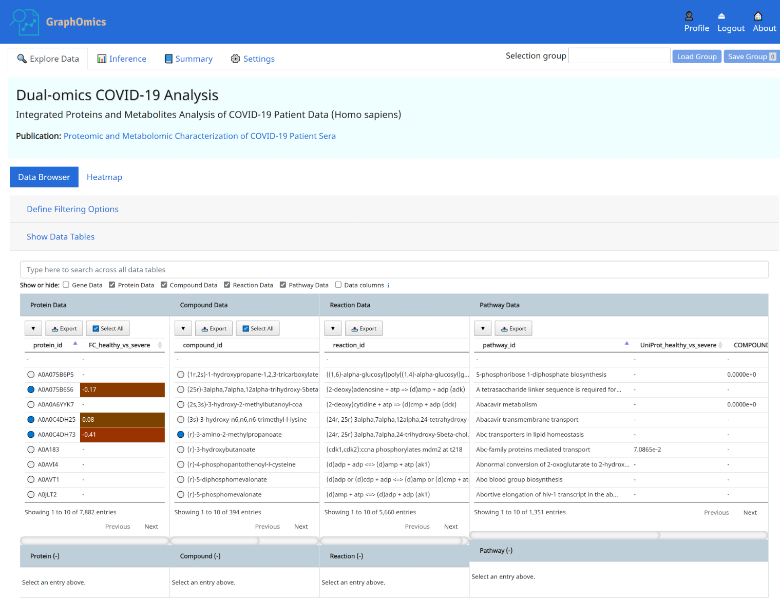
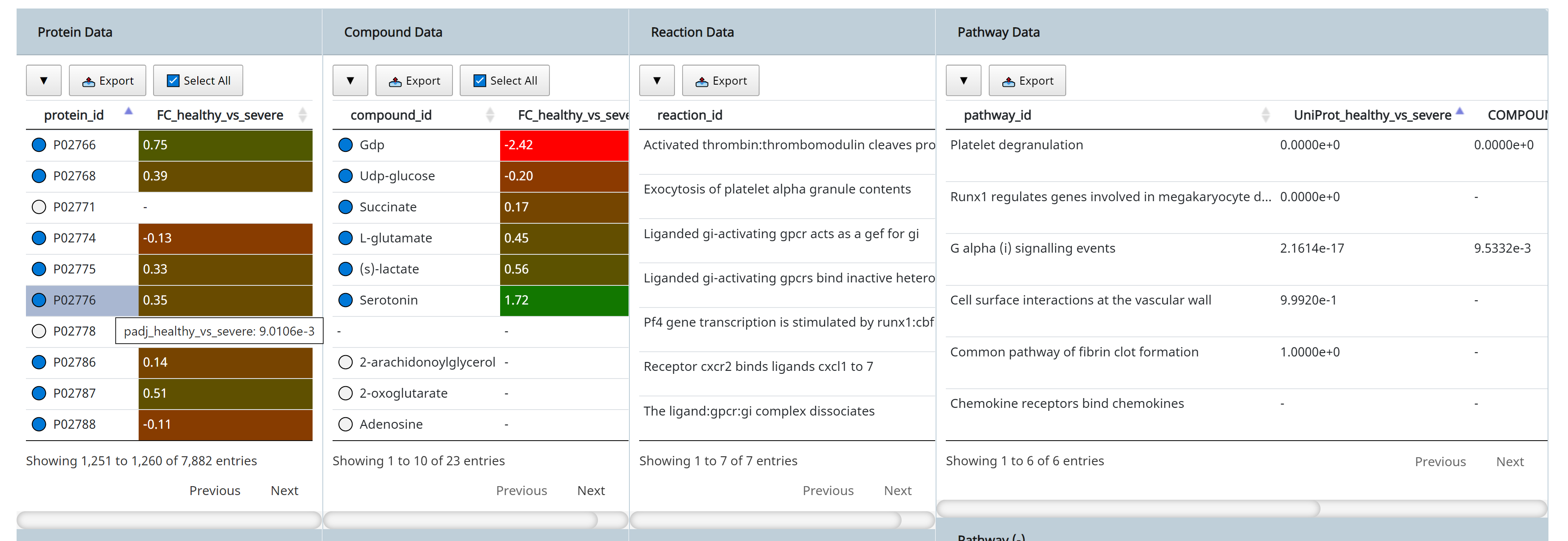
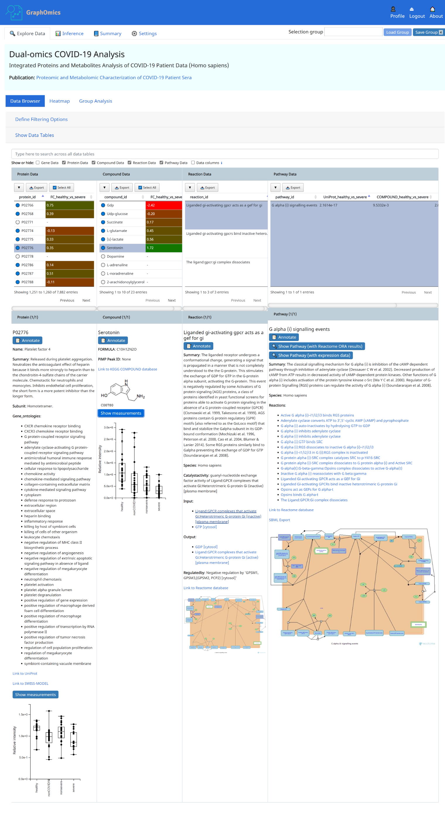
- Protein P02776 (PF4) is connected to 23 observed compounds through 7 reactions and 6 pathways. Observed entities ( present in the uploaded data) are indicated with a blue circle in the Data Browser, while unobserved are indicated with a white circle next to it.
- PF4 has a log2-fold change of 0.35 from the case (severe Covid-19) to the control (healthy) case.
- Hovering the mouse over displays the adjusted p-value of 9.0106e-3 from limma analysis of the differential expression of that protein between the two groups. See Section 6 on how to run differential analysis of entities.
- The connection between PF4 to other entities, such as compounds and pathways are shown. We can immediately see that PF4 is connected to Serotonin, which has a fold change of 1.72 and a limma p-value of 3.3110e-7. The original study highlighted how serotonin level changes with severity of the disease, and that could be easily observed here.
- The connection of PF4 and serotonin to the pathway Platelet degranulation could also be seen from the Data Browser. The column UniProt_healthy_vs_severe and COMPOUND_healthy_vs_severe in the Pathway Data table shows the p-value results of performing pathway activity level analysis using the protein (UniProt) and metabolites (COMPOUND) data respectively (see Section 7 on how to run pathway activity level analysis), and we can see that both entities (PF4 and serotonin) are connected to highly active platelet degranulation pathway, which could be explained by how platelets produced in the lung were activated in response to lung injury in the severe patients.
All information in the Data Browser could be exported for analysis in other tools by clicking on the [Export] button in each table.
3. Contextual Information Panel
The info panel provides additional contextual information for selected entries in the Data Browser. In the example
below, the info panel shows additional information for the selected PF4 protein, the metabolite serotonin and
the R-HSA-380073 reaction and pathway containing them. Uploaded
measurements, when available, can also be viewed in the info panel. Reactions and pathway diagrams are retrieved from
Reactome and shown here too. Users can leave annotations on interesting entities that they observe. This annotation will
be stored into the system, and can be viewed and shared with other users.
4. Query Builder
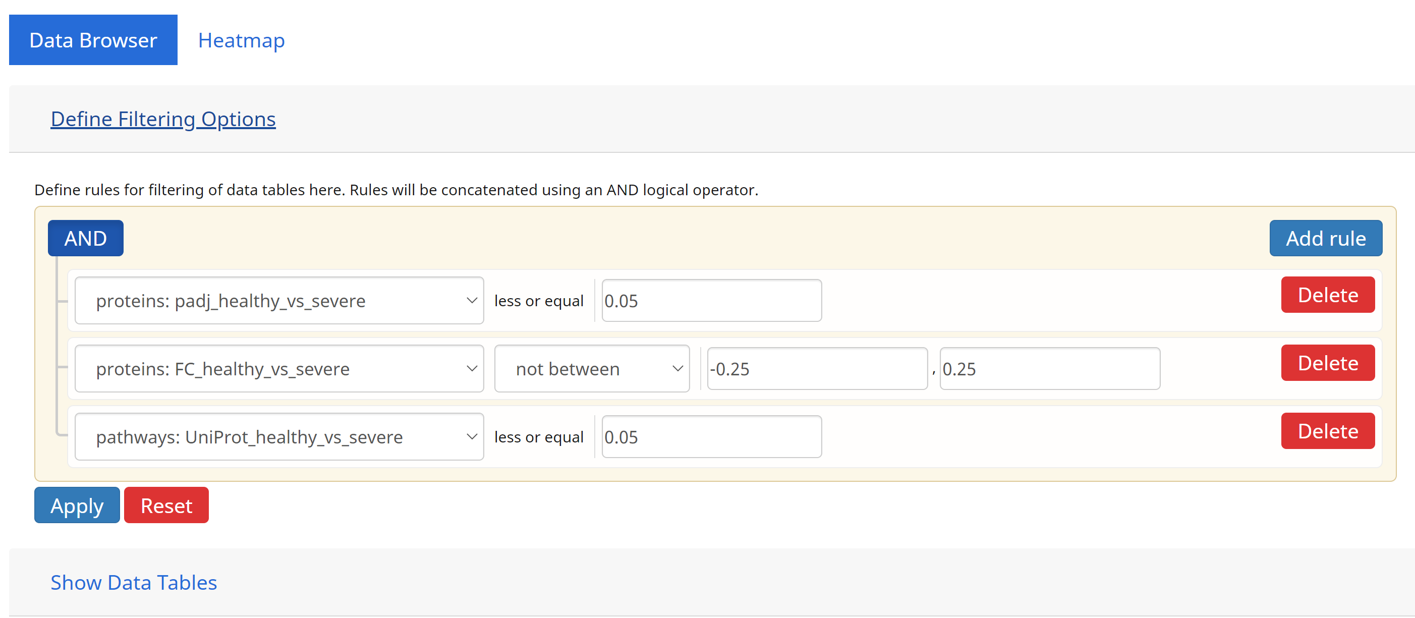
Users can define complex queries of entities on the Data Browser using the Query Builder. From here, comparion operators can be defined to limit entries in the Data Browser based on their p-values and fold changes. Users can also define queryes spanning multi-omics data by concatenating multiple queries on different omics data and combining them using the logical AND operation.
In the example above, we define a typical queryset based on the comparisons between the case (severe) vs control ( healthy) groups.
- Filter for DE proteins having p-values ≤ to 0.05, AND
- Filter for DE proteins having log fold changes at least 0.25 both ways (not between -0.25 and 0.25), AND
- Linked to pathways that are also significantly changing (p-values ≤ 0.05) based on their protein (UniProt) data.
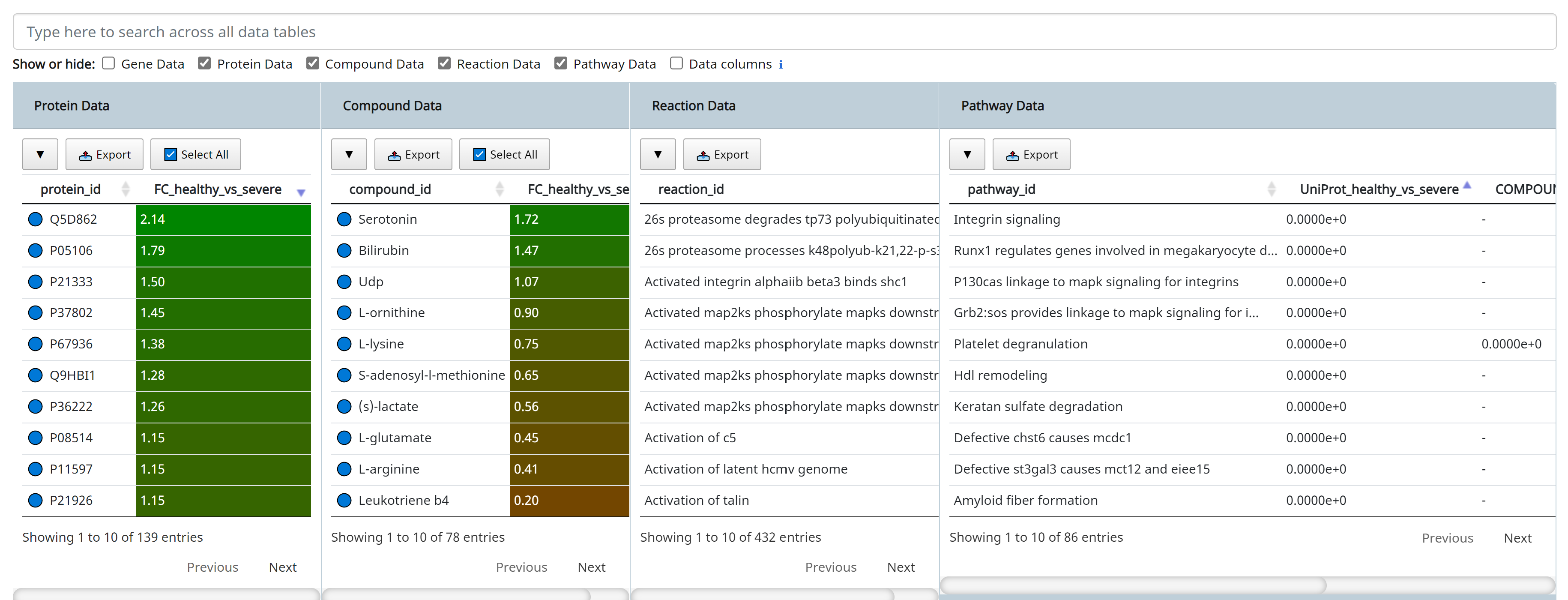
Click [Apply] to execute the queryset above. The results are shown below.
5. Interactive Clustering and Heatmaps
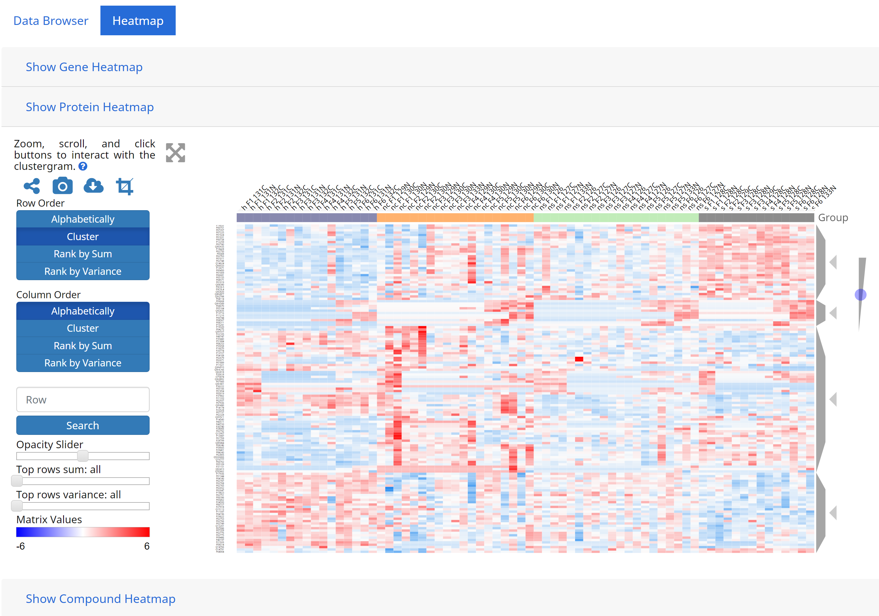
GraphOmics integrates with Clustergrammer, a heatmap component to visualise and analyse complex omics data that can also perform interactive clustering of data. Integration of GraphOmics with Clustergrammer is achieved through the Data Browser. Each omics data (transcripts, proteins and metabolites) supported in the Data Browser is linked to a Clustergrammer view (from the Heatmap tab). Entities selected in the Data Browser will filter other entities, and these entities are used to filter the view in Clustergrammers as well. As an example the following shows Clustergrammer results from the queryset previously defined in the Query Builder section above.
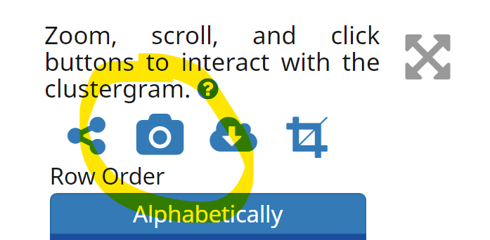
To export Clustergrammer results, users can also click the [Take Snapshot] button on the left-hand side of the heatmap.
6. Analysis
Users can directly provide fold-changes and p-values of differentially-expressed entities during file upload if they are already available, or perform such analysis from GraphOmics. In the case of uploading, currently we only support a standard case-vs-control comparison. Please ensure that in the CSV file, the following format is used:
FC_[case]_vs_[control]
padj_[case]_vs_[control]
for the fold-change and p-value information to upload in a comparison of [case] and [control] groups.
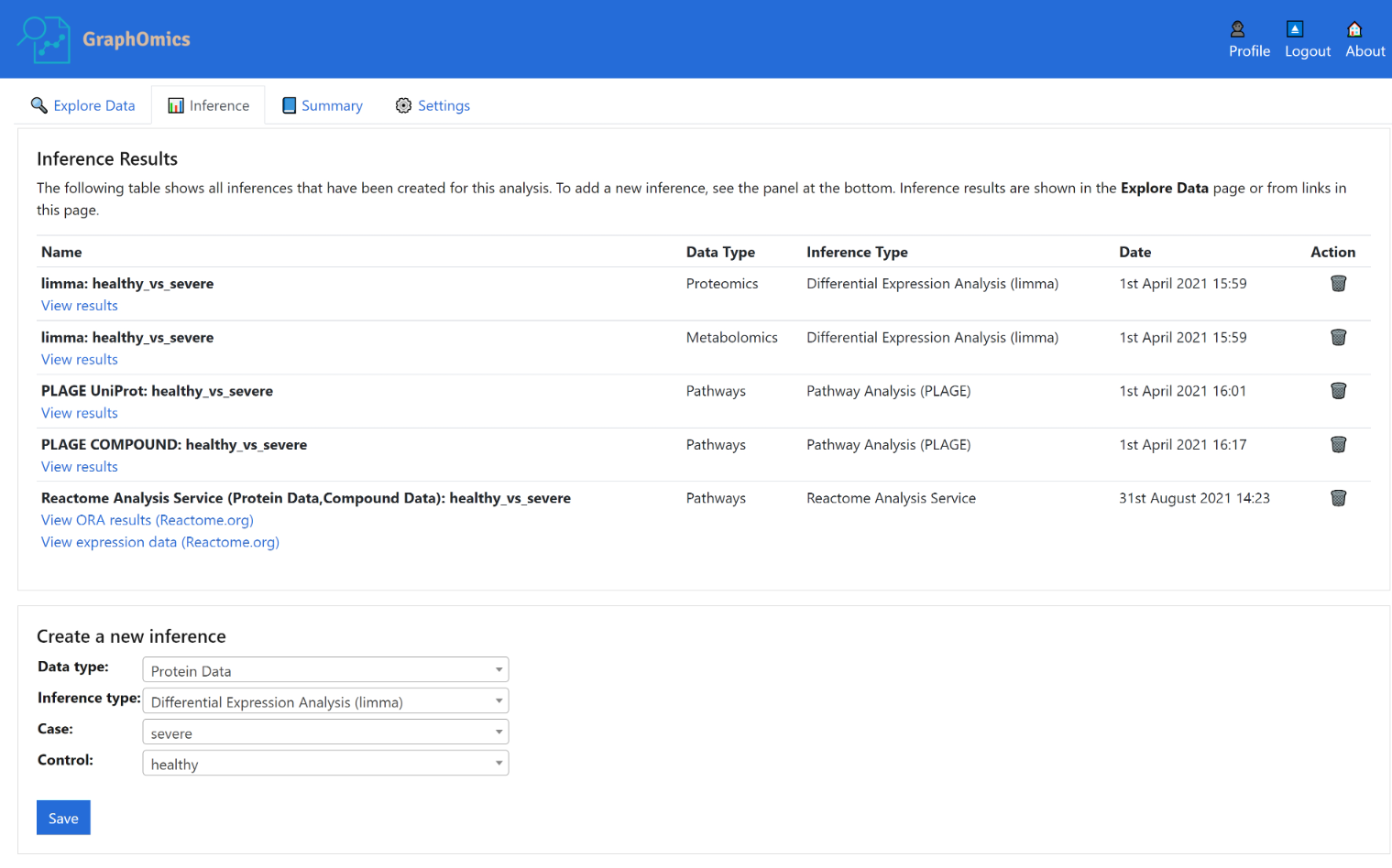
Alternatively from the Inference tab, users can also run various differential analysis. Currently we include standard t-test (correcting for multiple comparisons), limma and DeSEQ2 (for transcript data). In the example below, we see the Inference page containing a number of inferences already run on this dataset, including limma on the proteins and metabolites, as well as PLAGE on the pathways using the proteins and metabolites data.
Activity level analysis of pathways is also provided in GraphOmics. For pathway analysis, the PALS package is used to provide a unified interface to access various methods. This includes methods such as standard Over-representation (ORA) analysis to find pathways that are expressing DE entities higher than chance (according to the Hypergeometric distribution). GSEA and PLAGE methods are also provided.
7. Data Sharing
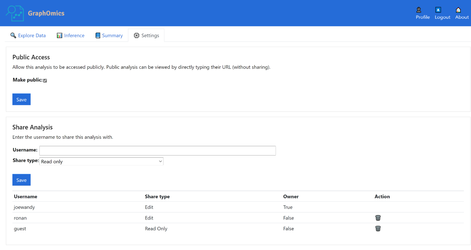
From the Settings page, users can share their data with other users in GraphOmics, or even make their experiments public so it is accessible for anyone on the Web.
To make an analysis public, users shoud click the Make public checkbox in the screenshot below. By doing so, this analysis will be made public. Public analysis can be viewed by directly typing their URL (without sharing). We will also feature public analysis on the index page of GraphOmics. Finally from the Share Analysis section below, analysis can also be shared with other users on GraphOmics by typing their name and specifying the access level (either ‘edit’ or ‘ read only’).
